Study Period: July 03, 2017 to August 23, 2017
Asset class: Forex
Currency Pair: EURUSD
Chart’s time frame: Monthly, Weekly and Daily time frames.
Symbol Information Forex:
Point value: 1,
Exchange: ‘FXCM‘
Currency: ‘USD’
Price scale: ‘100000 (six digits)’
Price format: ‘1.0000[0]’ Note: Ignore the last-sixth-digit, to get 5 digit pip value(four decimal places).
Minimum move: ‘1’
Pip size: ‘0.0001’
If ‘USD’ is the Cross Currency then Pip value is fixed. But, for any other currency Pip Value varies as Floating Rate
pip value.
Time zone: ‘UTC- 4 New York’ (ET),
Session: ‘Sunday-Friday 17:00-17:00’
Trade Type: EUR/USD Short
How currencies are Quoted in Forex trading?
Forex currency trades are quoted in pairs with a three-letter currency abbreviation. First currency of pair is always ‘Base, Face or National currency‘ – usually the larger of the two currencies. And second currency of pair is called ‘counter, secondary or Quote currency‘. In this example, ‘EUR is Base‘ and ‘USD is the Quote‘ currency.
The pair EURUSD is indicating in terms of how many units of the Quote currency (USD) it takes to buy one unit of the Base currency (EUR). Remember, for Base (i.e. EUR) unit ‘value is always =1’ and Quote currency ‘unit value is always changing‘.
At this time EURUSD is trading at 1.1662 (Last price) and months ‘s range was (is) 1.18414 Opening price on the candle and Closing price is 1.1801 (Note: the monthly candle is not closed yet!) . This candle or bar’s High is 1.1910 and Low is 1.1662.
Meaning of short :
Professional traders talk in terms of Buying (going Long) and Selling going Short, the currency pair, not just the quote currency. Forex currency pair are quoted in two prices bid and ask. Bid is a rate to Buy the base currency and Ask price is a rate to Sell the Base currency. The difference between the two, or the spread, is how the market maker makes a living. In this example of EURUSD SHORT trade type means, ‘EUR is Sold (Short)’ and ‘USD is Bought (Long)’
Rollover or Financing charges: Forex is traded in pairs, means every trade involves two currencies and two different interest rates. Here in this example ‘EUR’ is ‘sold or short’ and ‘USD’ is ‘Long or bought’. This translates to ‘EUR Deposited’ and ‘USD loaned/borrowed’. When we hold a ‘currency spot position‘ overnight, each currency has an overnight ‘inter-bank interest rate‘ associated with it. Deposit will get interest and loan will attract financing charges. Rollover is the ‘interest paid’ or ‘earned’.
How to calculate daily interest on base: [UNITS (LOT SIZE) ] x [BASE INT RATE] x [1/365] x[Base primary currency i.e USD] How to calculate daily interest on quote:[UNITS (LOT SIZE) ] x [QUOTE INT RATE] x [1/365] x[Quote currency i.e EUR] NOTE: If you hold this trade Friday thru Monday you will get one day, worth rollover. For futures contract rollover is inbuilt.
What is this Analysis About?
To learn Forex Swing Trading, I opened an account with FXCM and seeded it with $2000 USD. I started live trading, after getting basic and advanced training. After six months of Forex trading my account was 1765.95. Needless to say I was not impressed. I have had documented well, all my past trades, and tried to find Root-Cause-Analysis of my lackluster and uninspiring trading results. I started with a goal of earning $250 each month. Long story short, I want to go back to the basics, understand the nuts and the bolts Forex trading. My objective of present study is to look under the hood of Forex trading and develop a sound and bullet proof trading strategy based on solid foundation.
Trend Detection
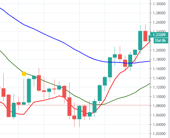
I use three methods to discover ‘TREND’ as, trend is already there, you just have to uncover it. First method is intuitive on visual, and other two are based on moving averages, ‘18 period fast EMA‘ in red color line and ‘50 periods slow EMA‘ in green color. To establish ‘long term primary trend‘, go to monthly chart, and do (1) ‘Intuitive visual check’ on last two HTF (1M) price bars, here they foretell an ‘unclear’ uptrend, both (2) ‘18 EMA sloping UP’, first candle is strong green but second candle fizzled out. Now look at (3) Location of price bars is ‘above 18 EMA line’, is yet another way to confirm the trend found intuitively, in step one. However, keep in mind EMAs are pretty lagging indicators, look at recent 18 and 50 period crossover vs trend reversal from Drop Base Rally formation. Crossover formed very late, after the bar reversal on chart. It will be prudent of me to check under the hood, any brewing up of trend reversal at RTF that is 1H chart. In fact, when I have a high stake trade (big lot, trend reversal or breakout) I even go to 15 minute time frame to see any signs of trend reversal. This is important step, if you don’t want to get caught off guard by market’s act of randomness.
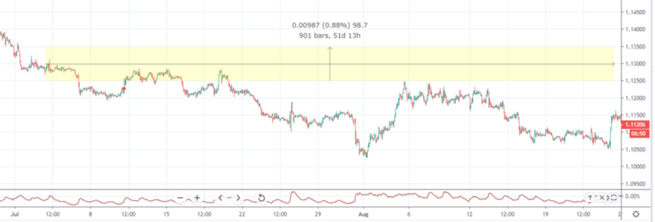
First chart-1 with time frame of 1M, with selected two monthly bars (60 days’ worth). ATR (14 days) is 0435 and price range for two months is $1.1305 to $1.1913 (608 pips), yellow box is a visual aid for monthly price range. Price movement on monthly chart: Open- 1.1841, High-1.1910, Low-1.1662 close-1.1801
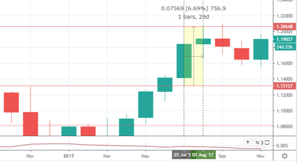
Chart-2 Time Frame 1W:
Selected bars: 8 weekly bars (56 business days’ worth) ATR: 0169
For next chart time frame is 1W and it has 8 weekly candles formed in 56 days, with a ‘Price Range of 591.6 pips’. For this trade’s trend you will notice 18 period fast EMA and 50 period slow EMA are still slopes up ↑ but compare 18 period EMA on monthly chart price bars on weekly chart are just “hovering over on EMA curve” itself, and Intuitive visual bars check on weekly chart bars must tell you, it is a sideways or choppy or congested trend. Price movement on weekly chart: Open- 1.1757, High-1.1828, Low-1.1730 close-1.1801 , and today’s price (23-8-2017) range on 1M chart with comparison with Weekly chart is 1.3583 and 18EMA. Two monthly bars have eclipsed 8 weekly bars, on this chart weekly bars are tiny and congested. I ‘think’ (know). I see it is congested, choppy or sideways trend. Another visual check I perform occasionally when I need a quick trend information, “if the right side of the chart is higher than left side it is an uptrend. Conversely, lower right side than high left side is indicative of downtrend.
Weekly Chart Gives Curve Location:
Weekly ‘Higher Time Frame’ chart serves my curve location monitoring, in other words I want to know where is the current price in relation to current turning points, aka zones to mark demand and supply. Find freshest and nearest prominent zones can be hard sometimes, but it will be ground zero, my ‘larger playground for trade’ I am planing. “Large playground”, here means, we have a weekly ATR, and within this daily ATR, sets the most accurate Price Range Movement. While this ATR range is pure Mathematics, curve serves as psychological boundary for possible turning points.
Developing a trading mindset:
When I stare at weekly chart without any prejudice for about 10 seconds, I think loudly, ‘O my weekly chart, “What is the predominant current trend?” and “Where is the curve location compared to current price?”. For trend I get very concise and unambiguous answer out of ‘uptrend’, ‘sideways’ and ‘downtrend’. As for curve location, answer can be anything from ‘high’, ‘middle’ or ‘low’. I have added one more question to my weekly chart, that is “is price near to 10% of upper or lower curve zones?”. If answer is yes, I have a special strategy to deal with this “counter trend“!
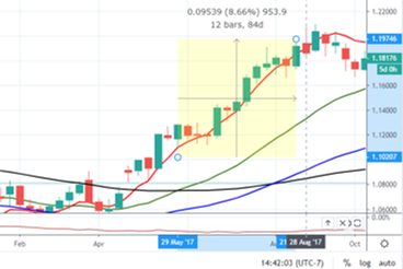
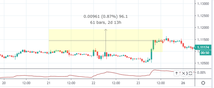
Chart-3 Daily Time Frame 1D:
Next ‘Chart-3′ is a daily chart with ’40 bars happened in 56 days’ (in fact 39 bars in 38 business days). Daily chart is on my Intermediate Time Frame, compared to 1W HTF, it has 5 times more candles. It is like a 5x zoom. That is why yellow box representing price range of 591 pips (check chart 1) looks so big on daily chart. Daily chart recorded ATR of 82 pips is 7 times smaller from weekly!– “larger time frame larger movement!”. For me this yellow box is very important which is price and date range for the selected period for the month. However, because I execute my trade on 4H charts, so my ‘yellow box range is actually the value of daily ATR’ and I add about 10% wiggle room for randomness and possible extreme movements.
I don’t want to be cheap here. In past, I have had very tight Stop-Loss points and that did not end well many a times. I know there are other traders with perfect and tightest stop-losses, but not me. Intuitive visual check on this chart yells ‘it’s a sideways trend’, and price bars are ‘below’ 18 EMA line, indicative of downtrend.
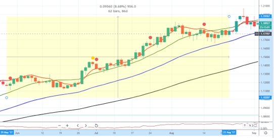
Chart-4(A) is on 4H time frame Lower Time Frame for my trade SETUP and execution. I decide where is my Stop-Loss, Entry and Target Price for profit. This is chart where I “identify and plot potential reversal areas”, where the retracement of the trend may resume the prevailing trend(i.e. current trend on HTF detected before). After plotting those levels next step is to, apply a “pullback trading strategy” that offers high-quality trading signals to enter trade, that offers a high reward to risk ratio.
Next Chart-4(B) (below) on 4H time frame is blown up to last 18 candles, formed every 4 hours (ET) a new candle and six daily candles, means this is three days worth candle data. Upper (1.1824) and lower(1.1744) red lines are 80 pips apart which is about daily ATR of 82. On FXCM platform each ‘grey box is 10 pips’ so you can quickly measure the price bar pip-value without using measuring tool.
Chart-5A represents RTF (Refine Time Frame) in this case 1H chart. It is mandatory for trend trader to check RTF twice. First, pre-trade check for the last time if trend is still your friend, and rule out remote possibility of trend reversal against your trade. Then second time, post trade you are in trade and you want your trade to follow through for locking in your profit by moving After you are in the trade. Also, if the trend in in Pay close to attention to breaks of trend-lines and zones points, both hand drawn and visual (psychological).
Whenever under lying conditions change, the reversal usually start manifesting itself from STF, so it will never hurt to make sure your trend from HTF or ITF is not in jeopardy! Should you suspect so, it is time to do something.
Check out Chart-5B concentrated version of one hour refined chart to detect any underground brewing of coup! Previously on Monthly, weekly and daily time frames trend is ‘sideways’ without doubt, therefore un-tradable. Is RTF telling me anything. Yes, 21 August downtrend, 22 August pretty much sideways, and 23 that is today, after strong uptrend few hours of sideways action. Only one thing worth noting is 50 period EMA is respected (senior trader’s way of saying, ‘bears tried but could not break this price barrier!’) and intuitive visual of 50 EMA was sloping ‘up’, it is somewhat flat with a hint of uptrend.
Trade decision:
So far objective finding are: Monthly, weekly and daily trend :”sideways”
Result: Sideways equals “no trade”
But I will keep tabs on this pair, wait and watch for a the strong trend. Time will tell what future holds. My mentor once told me “Do not predict the price, anticipate the probability“. So, let wait for August 24, 2017. I want to check any economic major report, event, correlation or border markets for USA or EU.
‘High-value” news releases about economic fundamentals
If the actual data diverges from the market’s consensus, expect a price movements. Traders can have a different interpretation of developing economic fundamentals, and they put their money behind their respective interpretations.When market participants try to interpret the new information and corresponding trading action, a new equilibrium is formed. When the majority of the market participants believe the price should go up or down, this supply and demand imbalance can act to drive prices higher or lower.

Leave a Reply